

 In 30 Seconds




An AQI of 250 does not mean that a city contains “250 units” of pollution. The Air Quality Index is a calculated score, designed to make different pollution measurements easier to interpret. It is not itself a concentration, a percentage or a reading of every contaminant in the air.
India’s national system was introduced in 2015. It considers eight pollutants: PM2.5 and PM10 particulate matter, nitrogen dioxide, sulphur dioxide, carbon monoxide, ozone, ammonia and lead. The government’s launch-era explanation describes the purpose and coverage of the index. Those eight parameters should not be mistaken for an exhaustive inventory of air pollution.
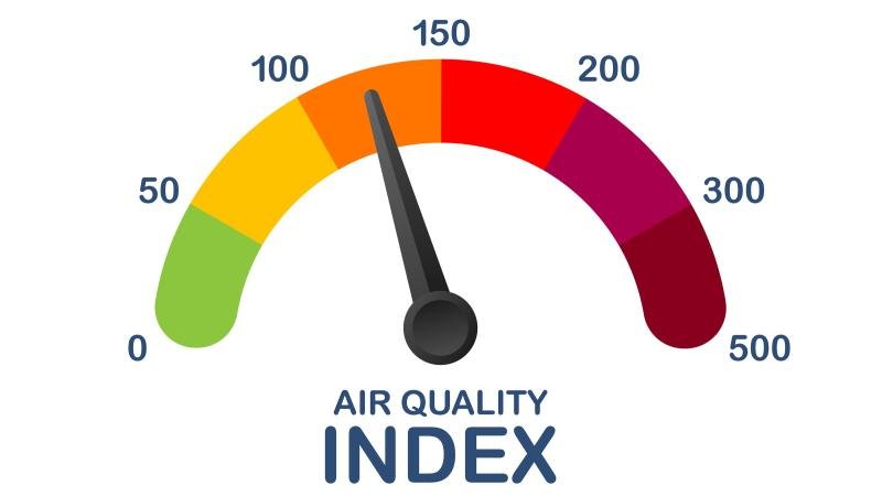
What do the six categories mean?
The official Indian scale uses these ranges, reproduced as factual reference values from the government’s air-quality monitoring chapter:
| AQI score | Category |
|---|---|
| 0–50 | Good |
| 51–100 | Satisfactory |
| 101–200 | Moderate / moderately polluted |
| 201–300 | Poor |
| 301–400 | Very poor |
| 401–500 | Severe |
The labels communicate increasing concern; they are not personalised medical advice. The monitoring chapter also sets a minimum data requirement: at least three pollutants, including either PM2.5 or PM10. A missing value should not be interpreted as clean air.
How is the final number calculated?
Each available pollutant concentration is translated into a sub-index using its own breakpoints. The highest of those sub-indices becomes the overall AQI. It is not a simple average that lets low readings cancel a high one. This is the method explained in the CPCB’s technical report.
For example, suppose a station’s valid sub-indices are 240 for PM2.5, 170 for PM10 and 80 for nitrogen dioxide. Its overall score would be 240, in the Poor band—not their average of about 163. These are invented sub-index values to illustrate the calculation, not live readings from an Indian city.
Why do PM2.5 and PM10 get so much attention?
The numbers describe particle size: PM2.5 refers to particles no larger than 2.5 micrometres in aerodynamic diameter; PM10 includes particles up to 10 micrometres. Fine particles can penetrate deeply into the lungs, and some can enter the bloodstream. The WHO’s pollutant guide explains the health relevance of particle size.
A concentration such as 60 micrograms per cubic metre is therefore a different quantity from an AQI score of 60. Confusing the two can turn a technically accurate measurement into a misleading headline.
How to read an AQI report more carefully
Use this editorial checklist before comparing two screenshots:
- Location: are both figures for the same monitoring station, or is one a city-wide summary?
- Time: do they describe the same period? An old screenshot cannot establish today’s conditions.
- Measure: is the number an AQI score, a pollutant concentration or a forecast?
- Method: do both services identify the same index? Matching colours alone are not enough.
A city label is convenient, but readers should ask what measurements sit underneath it. Equally, one neighbourhood’s reading cannot establish the source of the pollution: that requires additional evidence.
Does “Good” mean zero health risk?
No category is a personal health guarantee. The WHO’s air-quality guidelines describe evidence of health effects at lower concentrations than previously understood. Exposure over time also matters; a better score on one afternoon does not establish low exposure over a year.
Follow current local public-health advice, particularly when pollution is high or a medical condition affects your risk. AQI is a useful warning signal, but it cannot replace individual medical advice or tell us, by itself, whether a city’s clean-air policies are working.